Fedrigoni 365 (2025)
Design for the 2025 Fedrigoni’s annual collaboration with UK-based creatives
This year, paper manufacturer Fedrigoni and UK design studio TM (TsevdosMcNeill) chose “opposites” as the overall theme for the 2025 edition of their annual calendar project. The aim is to highlight unity and diversity through 365 contrasting concepts and 730 unique designs.
Each date in the calendar pairs two contributors who present contrasting interpretations of seed words such as “right/wrong” or “east/west.” With this edition split across two volumes, viewing each date side by side reveals the contrasts and similarities that can emerge from different creative perspectives and interpretations of the brief.
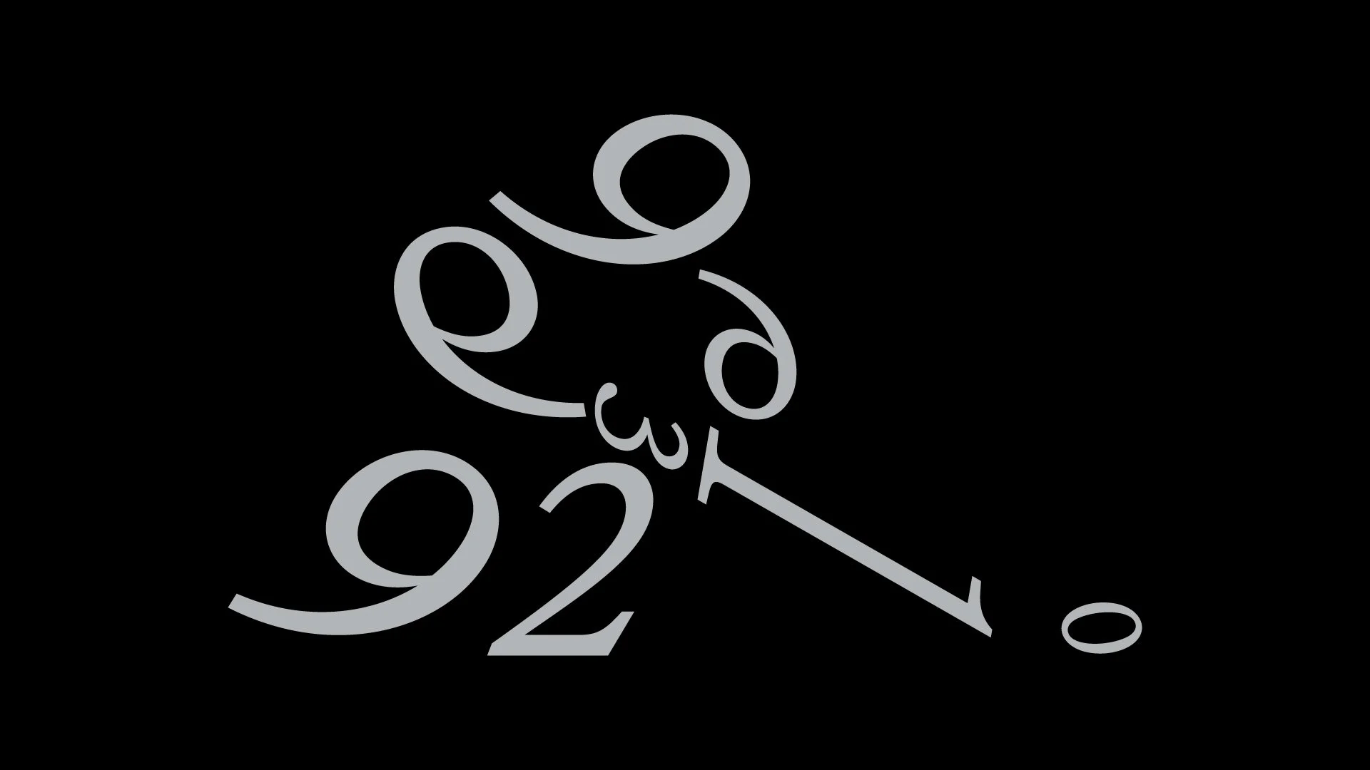
My assigned seed word was “then,” which I had to combine with the date 29th March. I interpreted the word in a backward-looking context, e.g., what happened back then, and searched for significant historical events that had taken place on 29th March. With a personal interest in sports, I was drawn to this date in 1999 as it marks when Wayne Gretzky, widely considered the greatest ice hockey player of all time, scored his final professional goal.
Inspired by the work of designers who transform and combine typographic characters to create new forms—most notably Jim Sutherland—I reorganised the numbers for this date (29/03/1999) into the figure of an ice hockey player in motion, shooting the puck.
Utilising an italic typeface in the design allowed me to encapsulate the idea of motion, as the curling “9” in the bottom left lends itself to a leg pushing off the ice and trailing behind in the act of shooting.
The two volumes of the publication—one printed on 14 “dark” and the other on 14 “light” stocks—explore Fedrigoni’s diverse range of coated and uncoated papers. They are housed in eight different slipcases made from Imitlin, introducing a packaging element for the first time.
Specification
Designer: TM for Fedrigoni UK
Dimensions: 166 x 220mm
Pages: 2x 416pp
Publication: 2024
Binding: OTA bound


